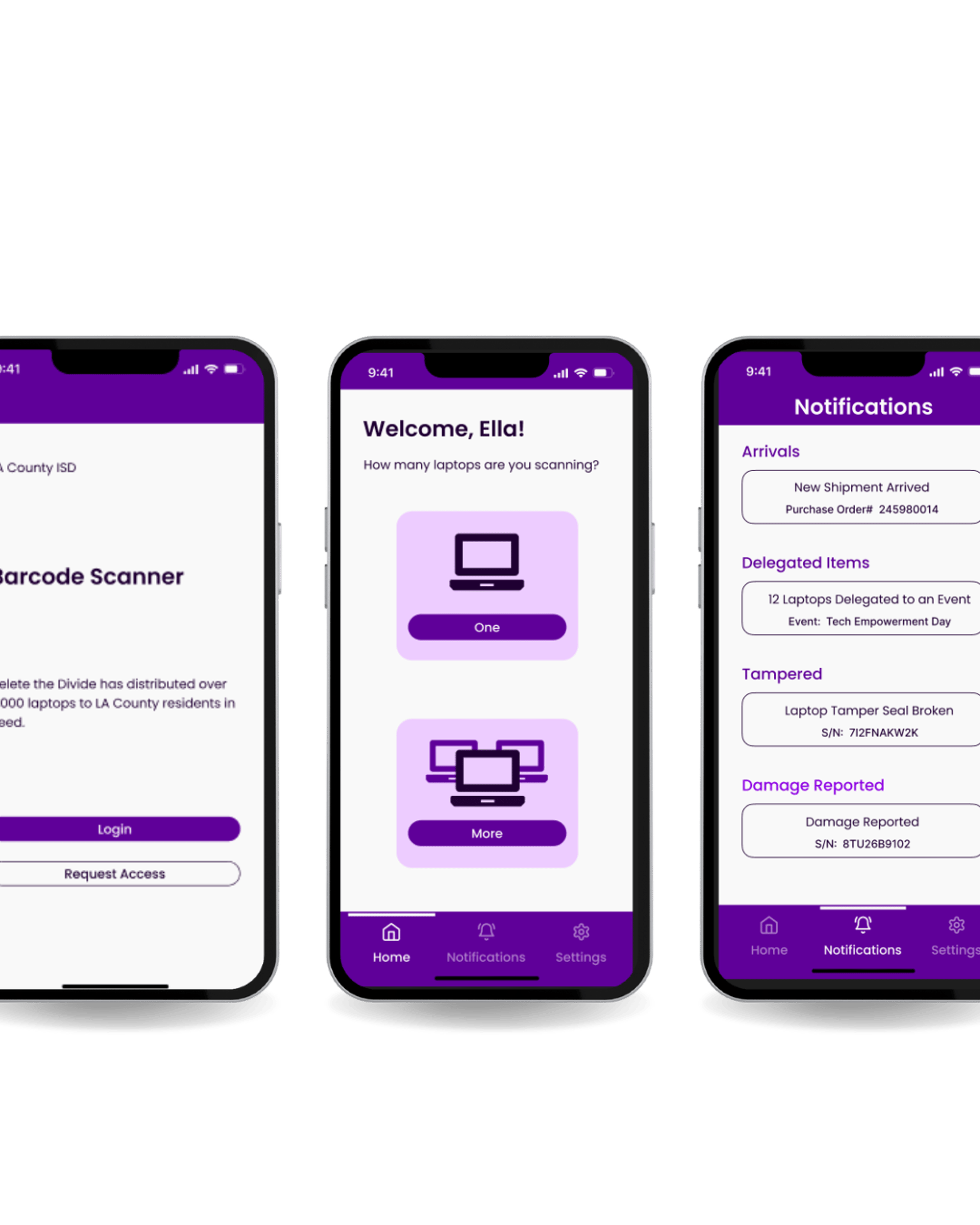
MOBILE INVENTORY TRACKER (M.I.T)
Role: UX Designer
Timeline: 10 months
Team: 10 Designers
Type: Government | Mobile-Interface
Tools: Figma, Photos, Illustrator

Project Overview
Inventory assets is the #1 problem in every department throughout the County of Los Angeles. This leads to hundreds of thousands of dollars every year in misplaced assets. One of the reasons for this problem is due to the difficult and complexity of the current system.
Goal
Improve, streamline, and modernize DTD's laptop inventory and distribution process to stay organized and prepared for future audits.
Problem Statement
Inventory of assets is a significant challenge countywide, leading to substantial financial losses due to misplaced assets.
Design Toolkit








Figma
Adobe xD
Adobe Illustrator
Miro
Design Process
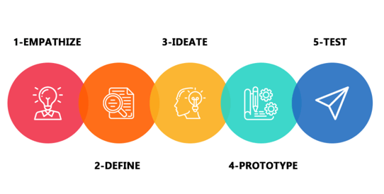
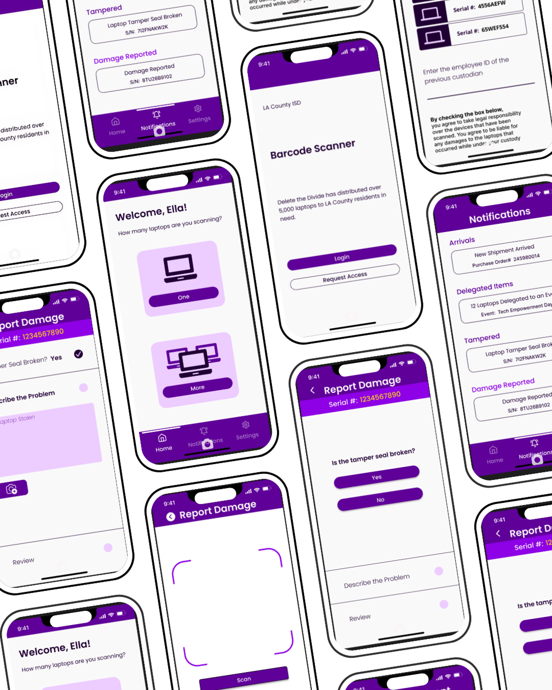
We used the 5-stage design thinking model to keep our designs as consistent as possible.
User Research
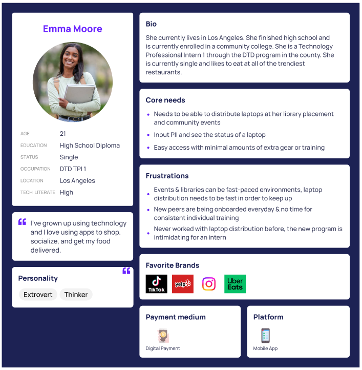
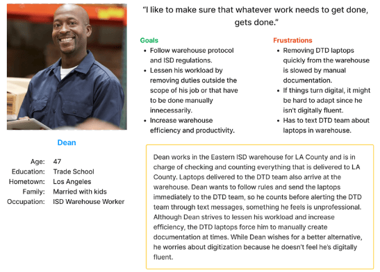
The first step was to conduct User Research and created personas to understand the target audience needs, preferences, and pain points. We then created Scenario Designs to depict how users will interact with the application in real-life scenarios. The users involved were:
Warehouse Workers
Delete the Divide Interns
Stakeholders
Los Angeles County Staff
Delete the Divide Staff
Scenario 1 - Account Page:
Jessica is a 19-year-old DTD intern who resides in Los Angeles County and works as a digital assistant for DTD at a Los Angeles County Library. She has used the barcode scanning app before and noticed that in the hamburger menu at the top left corner, it opens to a list with an array of options to choose from (‘Account Info’, ‘Settings’, and ‘Barcode Scanner’) to navigate the app. She becomes curious and decides she wants to press ‘Account Info’ to see what is on the page since she has never explored the app before. Here she’ll find her full name, email linked to her account, and a default avatar (profile picture) along with an option to edit her avatar which is located underneath in small, blue, and underlined text. She decides she would like to edit her current avatar, which is just a default grey person icon, and switch It to one of the pre-approved/chosen avatars in the ‘choose avatar’ section. So, she presses ‘Edit avatar’ located underneath the profile picture, and after selecting her new avatar, she presses ‘Save change’ which saves the changes. She then realizes that she doesn't really like the avatar she chose and presses ‘Edit avatar’ again and selects the ‘Default’ avatar which is the picture she had set originally before changing it.
Bailey, a 21-year-old DTD intern digitally assisting at a participating Los Angeles County Library just finished distributing a device to the assignee and would like to sign out of the app so she can get back to providing digital assistance to the library goers. She is currently on the distribution page and would like to navigate to the sign out portion of the app. To do this she simply presses the hamburger menu option at the top left corner of the screen and in the popout menu, she will direct her attention to the bottom of the menu where she’ll see an option to ‘Logout’ in bright red lettering. She presses this and the app quickly signs her out of her account, bringing her back to the login page where she can either log back in, or exit the app entirely.
Scenario 2 - Log Out Page:

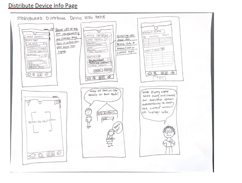
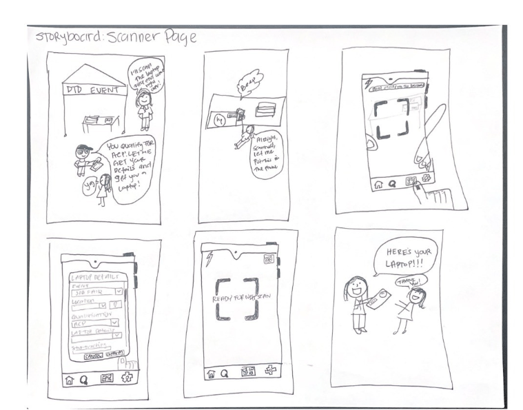
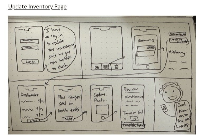
Storyboards
Developed storyboards to visualize the user flow and navigation within the application.
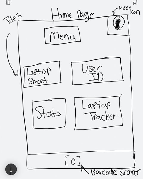
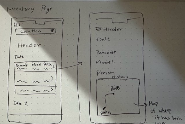
Paper Wireframing
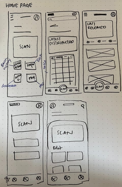
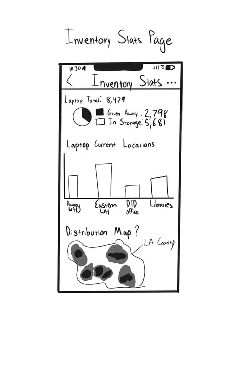
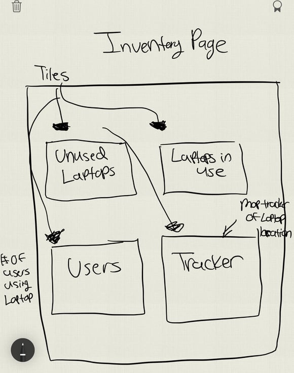
We created wireframes to outline the layout and structure of the application's screen and elements.
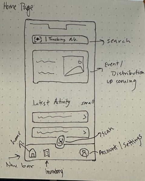
Home Page


Inventory Page
Low-Fidelity Prototype
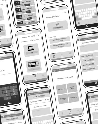
Defining the flow of interactions and transitions between the different screens, the team created a low-fidelity prototype in Figma.

User Testing
For our Usability Testing we interviewed 8 individuals.
4 - Delete the Divide Interns (Remote)
2 - Los Angeles County Staff (In-Person)
1- Internal Services Warehouse Worker (Remote)
1 Program Administrator (In-Person)
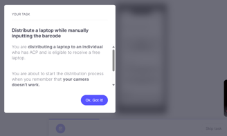
We utilized the software, Useberry and had participants completed 3 tasks and gave them an opportunity to explore the prototype after.

Findings
The team decided to test some of the basic and common operational tasks needed to navigate and utilize the app. The included features in the test are:
Entering the serial number of a device manually.
Delegating a laptop to an event.
Reporting a broken tamper seal.

Task 2: Most users were able to navigate to the scan faster, click on "multiple scans" and select "delegate to an event". Some entered the serial number manually, while others hit the "scan" button. Users were able to navigate through the app a bit faster.
Task 1: Participants visually expressed confusion and curiosity when navigating the app; Participants were unsure on how many serial numbers to display. Regardless, users were able to click on the scanner icon on the navigation bar, select appropriate scan and manually input the serial numbers.
Task 3: Some users were able to navigate quickly from the homepage, select scanner, hit individual scan, and select report damage (50 % of users entered the barcode manually, while the other 50 % hit the scan button). Some had issues when asked to "describe the problem" and they attempted to type something when the keyboard came up. Some went to the task overview a couple times but were able to complete the task.
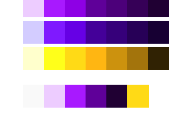
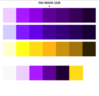
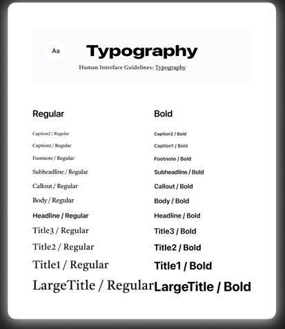
All participants stated the application was user friendly, easy to navigate, and well designed. The participants feedback will help us create a better home page interference, color scheme, accessibility, and font.
Redefining the Design
Improvements
After user testing, we focused on the home page refresh by getting rid of "View History" and making the scanner available in the middle of the screen to have easier access. This will help the workflow be easier and faster to navigate for users.
Created a more intuitive look with better wording and icon usage to help users, as well as provide a tutorial on how to navigate the app.
We added a more user-friendly way to flag laptops in the case that a user is scanning multiple and be able to identify which laptops belong to their respective serial numbers.
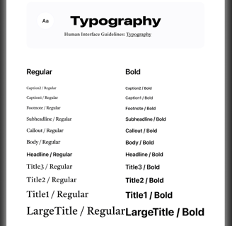
Color Palette & Typography
Project Success
The involved DTD interns got experience by researching and developing every portion of a mobile app from SCRATCH.
Successfully releasing a mobile app and following all County policies and procedures in less than 10 months, something that is rare within the County.
Mobile App was pushed onto County devices, and first real application with users was completed!