CPR 32
CPR32 is a Los Angeles County Based App. One of the most populated counties, and with new skills being taught, Los Angeles County needs a tool that helps people learn how to perform basic CPR. CPR32 primary target users include young adults who are seeking a new skill to learn.
The product
The Problem
18% of Americans know CPR. The team at CPR32 has identified it takes 8-10 minutes for medical personnel to arrive at their resident. In the case of an emergency life saving measures can be performed until 911 arrives.
The Goal
Design an app that will improve education on performing basic CPR until medical professionals arrive on scene.
My Role: UX designer leading the app and responsive website design from conception to delivery
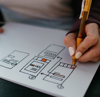
Responsibility: Conducting interviews, paper and digital wireframing, low and high-fidelity prototyping, conducting usability studies, accounting for accessibility, iterating on designs, determining information architecture, and responsive design.


Understanding the User
User Research: I used CPR32 to develop interview questions on performing CPR, which then used to conduct user interviews. Most interview participants reported not knowing how to perform CPR , but they didn’t actively try to search it up or reported they were discouraged due to too many searches. The feedback received through research made it very clear that users would be open and willing to learn basic CPR if they had access to an easy-to-use tool to help guide them.


Personas


Starting the design


Refining the Design


Responsive Design


